Taking to Instagram, the National Aeronautics and Space Administration (NASA), has recently posted a visualization that displays how greenhouse gases affect Earth’s water bodies.
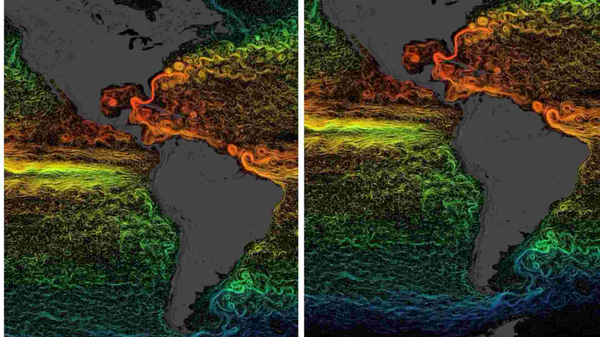
As per NASA, the gases produced due to human activities are altering the ocean. Talking more about their visualization, the space agency revealed, that different colours reflect average temperature of sea surface currents.
According to space agency, warmers colours (red, orange, and yellow) depicts warm temperatures, while cooler colours (green and blue) depict cooler temperature.
It further revealed, that increasing produce of greenhouse gases from human activities are forever altering our oceans. NASA vowed, that they will try to find more.
View this post on Instagram
So far, the video has gotten more than 8.2 lakh views and has accumulated over 8,000 likes.
Under this post, netizens gave various reactions. On user complimented the visualization and the way it was collected. ‘Amazing data and visualisation. Very cool!’ said instagram user.
Contributing to the praise of the visualisation, one also said, ‘I could look at this forever’.
But many users expressed their concern for climate change, with one saying, ‘Climate change is a huge problem’
Later, one user asked about this data and what is it was trying to show. Responding to the comment, NASA said, this visualisation is displaying sea surface current flows.
‘Can you please explain what this data is showing? Is it taken over days or months? What time of year? Is it ocean currents or ocean temperatures? What have we concluded from this data?’ asked one user.
In response NASA said, ‘The visualisation shows sea surface current flows. The flows are coloured by corresponding sea surface temperature data. The time range for this particular visualisation is from 2007-2008.’